A Bit of a Rant on Mobile Sites and Marketing
December 13, 2016
5 Website Design Trends That Never Go Out of Style
January 17, 2017
Have you ever been frustrated after clicking on an ad or tweet for an offer and come to a page where you can’t figure out what is going on? How many times have you continued on to purchase that offering? Probably zero percent of the time? However, your visitors are different, right? I hate to break it to you but they will get just as frustrated.
Test after test in conversion rate optimization has shown that less is more when it comes to conversions. I read an article recently by Aaron Orendorff at ConversionXL that cited a test by an online website called Sticker Mule. They tested a version of their homepage where they showed the variety of product offerings versus their original page where it just showed their top products and a Shop Now button. Incredibly, the test version of the homepage saw a 48% DROP in revenue. You would think that the opposite is true. Why?
Lead the visitor by the hand
One of the biggest assumptions and thereby mistakes of website design is the assumption that a visitor will know where to go and what to do. You must have well defined steps particularly when a sales funnel is involved. Visitors tend to wander and lose track of where they are, so to prevent that, you need to make it perfectly clear where they need to go.
If you are using advertising to increase traffic, you want to make sure that the page you send them to matches their expectation. It is very tempting to take the position of “now that I have your attention here, have a look at all these other things”. Stay focused. There is no better way to lose a sale then to confuse and frustrate your visitors.
Single focus pages are key
Whether it is a landing page or a product page, ask yourself, “what is the ONE thing I want them to do here?” Then design the page so the only option for a visitor is that one thing you want them to do. Visitors don’t read and they rarely scroll so don’t make them think.
I know what you are thinking. What about upsells or related items? There is nothing wrong with having them on the page as long as they are out of the way of the single purpose and focus of the page. The visitor came for one particular product or service and distracting them with other options or items could lead them out of the sales funnel and possibly off the site without a purchase.
Less is more
One of the greatest design techniques out there is underutilized in web design, it’s called, white space. White space is basically the space around something in a design that is devoid of anything other than color. It is used to focus the viewer’s attention toward an object on the page. Using white space on your product page helps the visitor focus on what is important and makes the path through the sales funnel much easier.
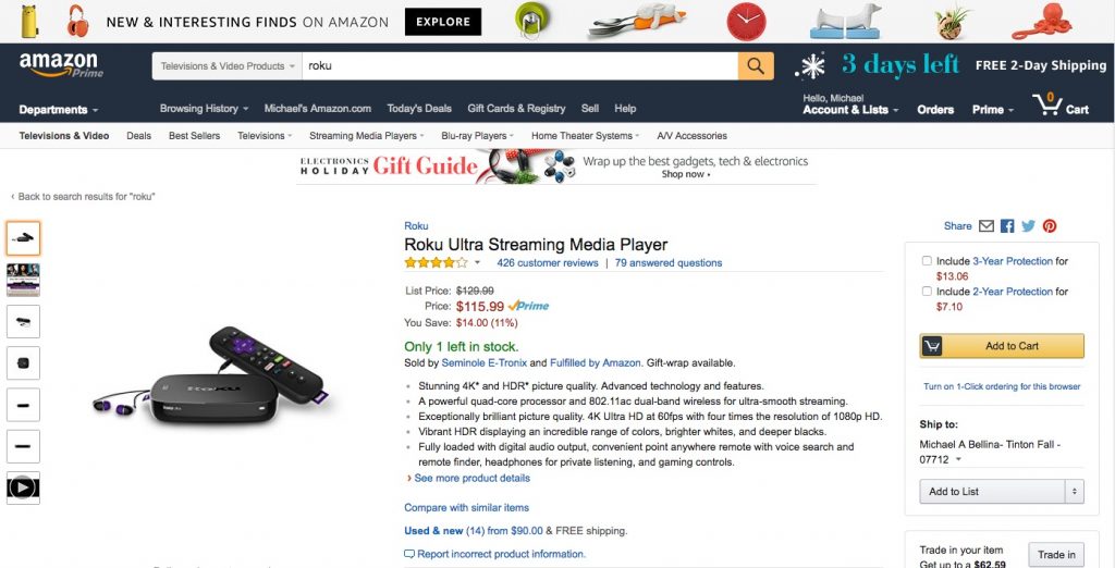
Here are two examples of Amazon’s page for the Roku Ultra Streaming Media Player and the same product on Roku’s site.
Amazon.com
Roku.com
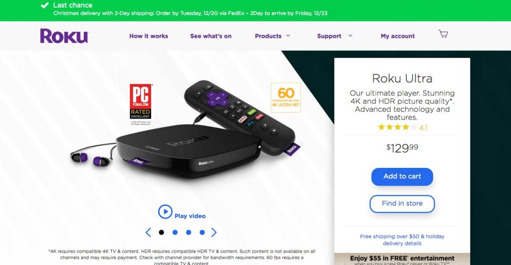
You can see that the Roku site is much cleaner and less distracting. On the other hand, Amazon’s site has stuff all over the place. If the visitor is unfamiliar with the site, this could lead to confusion, distraction and a missed conversion.
In the end, let’s just K.I.S.S.
We are all familiar with the K.I.S.S. (Keep It Simple Stupid) acronym. I think this process should be the overarching goal of your design. Not allowing the visitor to be distracted and wander off to other pages is a great way to increase conversions. Interactive design expert, Steve Krug, offers up a bit of advice, “Get rid of half of the words on each page, then get rid of half of what’s left.” I think when it comes to designing for sales funnels, this is really great advice.


