
Why Google Analytics Is Only Half the Story
September 13, 2016
Don’t Blame the Platform Blame the Process
October 18, 2016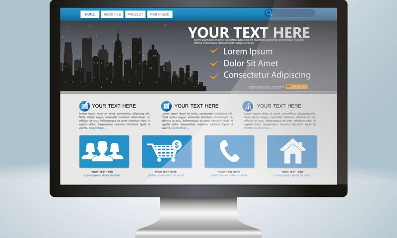
When responsive websites came on to the scene a few years ago they were a web designer’s dream come through. They were an easy way to convert a desktop site into a mobile format quickly. Even better, many WordPress themes came responsive right out of the box. Even less work and less having to think about it. Well that is where the problem is for me.
Don’t get me wrong, I made some pretty decent money converting sites to mobile by manipulating CSS (Cascading Style Sheets). However, as I worked more and more with responsive sites the more I realized that they don’t replace a planned out, mobile optimized website.
To review, responsive websites take the elements of the page, move them around and resize them to fit into different sized view windows. Typically this is done by collapsing the menu into a button at the top and taking the right column and dropping it below the left column to form one long column that you can scroll. Structurally, that makes perfect sense. You read left to right so naturally you would think that the left column is more important than the right. You would be right except for one major design issue, WordPress.
WordPress themes make it easy to have your mobile site fail
For example, WordPress typically displays their sidebars on the right. Yes, there are themes that have the option for either right or left sidebars but most designers like the 60/40 split with the left column being the larger column and besides when you are looking at themes most display it that way by default. That is how you envision your site to be as well.
Because the sidebar allows you to add all different kinds of snippets, the contact phone number, the sign-up forms and additional information goes in that column reserving the larger column for the main text of the page. When that responsive design converts to mobile, guess where all that information goes? Right to the bottom of the page. If you rationalize it by saying visitors will scroll, you would be right about 25% of the time.
Another issue for me with WordPress is that big hero slider at the top. It looks really great on your 27 inch monitor but when it shrinks down to a phone size, it becomes really small images with really small text. I would say that visually they look great but as my dad would say, “it’s about as useful as tits on a bull.” The slider is usually a dead zone for clicks. Worse is many visitors will not scroll past them so thereby pretty much leaving the text on the homepage unread. This goes for mobile as well as these sliders just end up taking one third of the screen where you could be enticing a visitor to read on.
Finally, these themes provide very little customization for the mobile version of the theme. This usually leads to having your developer run through hoops to make it work or you being told that work is additional time and money. This could be avoided.
You should plan your mobile site separately
Yes, even though your WordPress theme comes with a very nice mobile version there’s a good chance that once you load your content into the theme it is not going to display what is important in the proper order. Once your content is decided on, it is time to sketch out the mobile display of that information. Even if you purchase a pre-built theme, this is essential. Mobile needs to be simple and fast. Nothing is more frustrating than trying to scroll down the page to read and being met with roadblocks along the way.
It is important to not fall in love with how a theme looks when you purchase it. In many cases they are a solution to someone else’s problem. Not yours. I’m not here to discount the hard work of theme designers. Themes are a great starting point for many websites but they should be just that, a starting point. Even the best theme has flaws. Not necessarily in their creation but rather in how your information and content fits into them. It is like buying a suit off the rack and not getting it altered. Generally it fits but not the way you had hoped.
In the end, it is up to you to take a step back and really think what your website design needs to do for your business. An off the rack solution can get it done quick but my guess you aren’t going to be totally happy with it and will have to spend more money and time fixing it to work. If you are going with a pre-built theme, I would sketch out what you want to see then find a theme that fits that solution rather than the other way around. Simply put, those who fail to plan will, in the end, plan to fail.
